Tuesday, June 30, 2015

Otto Neals Retrospective, Curated by Dr. Myrah Brown Green

There is currently a 6 venue retrospective, in New York City, of the work of legendary Brooklyn artist Otto Neals – please see the end of this review for the addresses of the venues. 

{{{Young General Moses, 1984 - click on images to enlarge them}}}

Jacob Lawrence, an artist Otto Neals knew, and whose ‘Migration’ series you may have recently seen at MoMA, once said, “If I have achieved a degree of success as a creative artist, it is mainly due to the black experience which is our heritage – an experience which gives inspiration, motivation, and stimulation.” 

{{{Afro strut 1992}}}

Like Lawrence, Neals seems to draw largely from aspects of African American culture, but he doesn’t seem to focus so much on specific historical or sociological situations as Lawrence did. Therefore, to a great extent, Neals frees his African American and African subjects from a historical or social context that might otherwise be used to too narrowly define them. He does, however, keep his subjects within a strong cultural and community context. 

The identity of his subjects is often established within their communities and the over-arching culture of a people often forced into a status of segregation from the ‘dominant’ culture and consequently forced to adopt survival (and victory) strategies based on mutual support, community concern and positive, pro-social action to the benefit of all – to become, as MLK Jr. put it, the ‘thermostat’ to ‘transform the mores of society’. As Dr. Myrah Brown Green (the curator of this retrospective) explained to me, Neals work focuses on “…family, community, people in the places that he has traveled to (Western Africa, Egypt, Gullah Sea Islands, Caribbean Islands), those he knows, African/Black culture, historical figures,  and people and friends in his neighborhood.”

{{{A Study in Ochre - 2002}}}

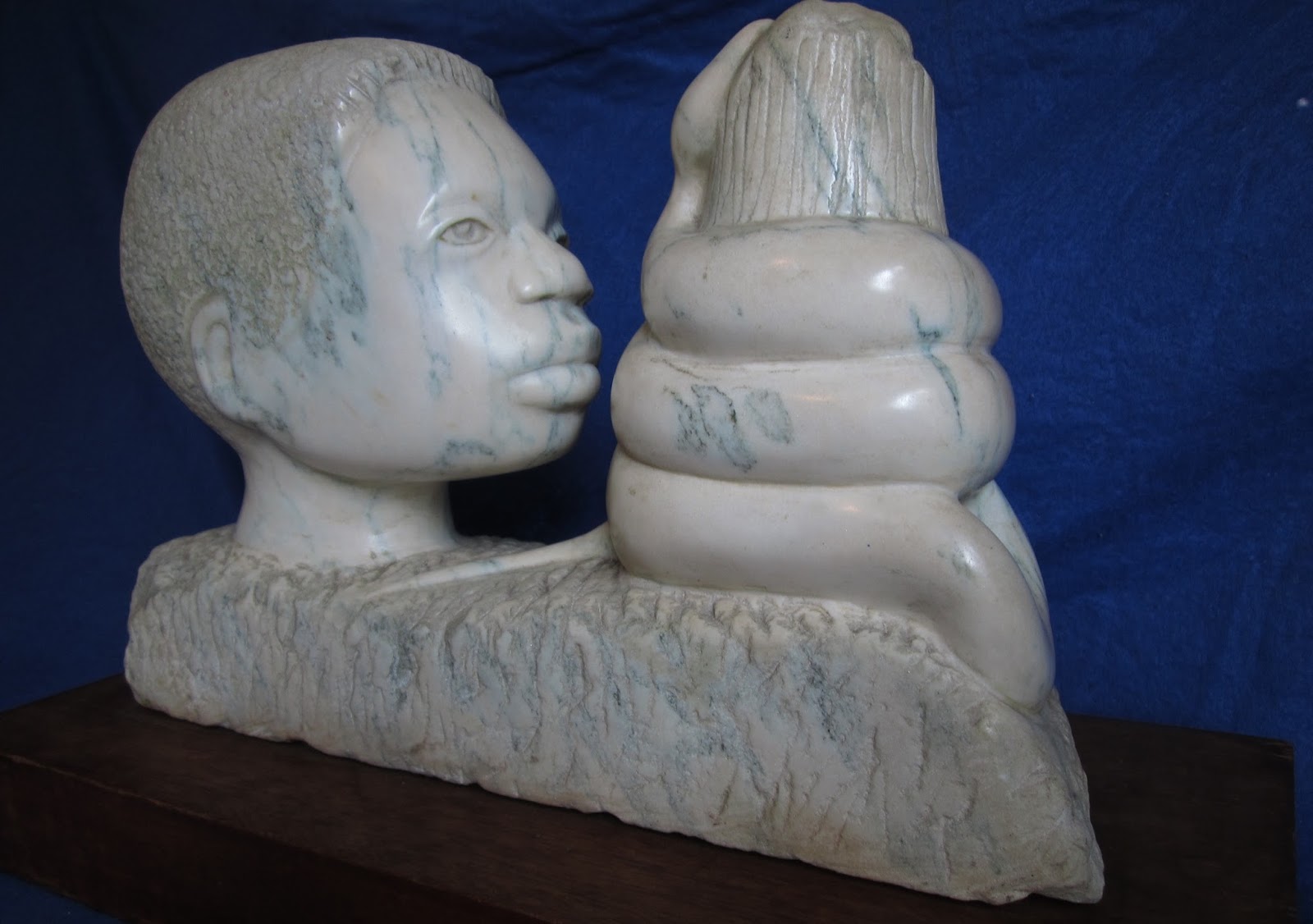
If we look at some of the pieces shown here, we see a ‘young General Moses’ who clearly has African or African American features. Neals clearly appropriates the Moses/Exodus narrative for the African American experience, implying a need for an overall ‘thermostat’ strategy and perhaps strategist with vision and resolve to help ensure the further progress of the cause of justice, meaningful integration and development for Africans and African Americans alike. Indeed, I may be wrong, but this could be a sculpture of Harriet Tubman, who was a type of Moses who led blacks who escaped from slavery to freedom. “Afro-strut” is a sensual statement of self-confidence and forward movement. “And We Didn’t Know Who He Was” is a simple but powerful tip of the hat to Kwame Nkruhma, sometimes called the African “Lenin” – a man educated in the USA who became Ghana’s first president and one of the strongest proponents of anti-imperialism and pan-Africanism (an amazing person – please do some research on this guy if you are interested in modern history).

{{{Curiosity 1969}}}

It’s not just the content and meaning of the works that Neals displays that make this retrospective worth checking out. It’s Neals himself, born in South Carolina in 1930 and largely self-taught. Throughout his life he has accepted the challenge of numerous artistic media and seems to have mastered every technique he has attempted. Indeed, despite what some might feel is a lack of ‘formal’ education, and a background not associated with other famous artists (Neals worked at the US Post Office as an illustrator for many years), his dedication to experimentation, especially in regard to his continuous mastery of new materials, raises him far above ‘outsider’ status and places him firmly in the position of an artist who merits further study. Indeed, his work is to be found in collections throughout America. In his dedication to the exploration of what exactly might be possible through various materials and techniques, and his strong commitment to and belief in his community, Otto Neals is a true New York City cultural treasure.  

{{{And We Didn't Know Who He Was 1997}}}

See Neals work at:

Wilmer Jennings Gallery at Kenkeleba (until July 25) – 219 E. 2nd Street at Avenue B, NY, NY

Tabla Rasa Gallery (until July 9) – 224 48th street, Brooklyn

Dorsey’s Gallery (until July 5) – 553 Rogers avenue, Brooklyn

Medgar Evers College (until September 30) – 1650 Bedford avenue, Brooklyn

Skylight Gallery (until September 20) – 1368 Fulton street, Brooklyn

Rush Arts Gallery (until July 8) – 526 W. 26th street, Chelsea, NY, NY  

Saturday, June 27, 2015

Random cell phone shots - 6/25 - Chelsea 6-8pm

{{{click to enlarge images}}}

Before I head over to the galleries I often relax at the park, on 10th avenue and 22nd street, called Clement Clark Moore Park.  The park used to be part of some farm land owned by Captain Thomas Clark, an English officer who gave the name "Chelsea" to the entire neighborhood (a tip of his hat to London's Royal Chelsea Hospital, which cared for aging ex-soldiers).

http://www.nycgovparks.org/parks/clement-clarke-moore-park/history

These are two shots I took with my smartphone, looking up from the bench I was sitting on. Trees seem to represent a type of bridge between the lower and higher, the earth and the sky or our animal and spiritual natures.

{{{click on images to enlarge them}}}

Here are some random shots I took during this opening night:


From the Martos Gallery - a piece by Scott Campbell. Yep, that's an actual, functional car with the grim reaper emblazoned on the hood. So I am guessing Campbell is channeling the tradition of vanitas art. A car could be considered a symbol of transition, so by applying such a vanitas image on one, it could indicate a type of 'vehicle' for resurrection or transition from one type or mode of life to another.


That's a bathtub lined with razor blades...but they are lying flat, so I'm assuming that if a person were really careful he/she might not get cut if he/she stepped in there.


This is at the Tagore Gallery these days.  What does it mean? Hmmmm. I'm guessing this piece follows in the Marcel Duchamp tradition of rendering useful stuff useless in order to glean a symbolic meaning from everyday objects.  Razors are used, primarily, to remove excess hair or stubble from men's faces - so they serve a grooming or tidying function. So altering the use of the blades might indicate an abandonment of this tidying or grooming function - while elevating the function or meaning of cleansing by water.

In the meantime, while bathing, you are aware of being in a disturbing situation where the threat of potential harm from the blades has been altered. A threat is removed but a lingering sense of discomfort and fear exists. 


From the Paul Kasmin Gallery (pic above and pic below - from the group show: The Written Trace)


So I'm guessing we have a knowledge of good and evil versus the fruit of life. But both are stuck in some kind of muck. It's as if our knowledge of the choice between knowledge and life pollutes both choices some how.

Thursday, June 25, 2015

Discarded Insulation Material on 25th Street in Chelsea – An Amazing Work of Public, Ready-Made Art

{{{click on images to enlarge them}}} 

In Walden Thoreau recognized the central importance of “heat” as one of the necessities of human life: “…for while food may be regarded as the fuel which keeps up the fire within us…shelter and clothing also serve only to retain the heat thus generated and absorbed. The grand necessity, then, for our bodies, is to keep warm, to keep the vital heat in us.”


I saw some amazing discarded insulation material on 25th street while at the openings tonight (6/25), and it was the best ‘ready-made’ art of the evening. I took 4 quick snapshots with my smart phone.

So what is the symbolism or significance of discarded insulation material?  Well, first of all, just look at this beautiful stuff! It looks like a mixture of thick, wild animal fur and synthetic NASA-like material to cover a planetary rover from excessive solar radiation. It potentially embodies the attempt involved in recognizing a natural survival mechanism or function that evolved over zillions of years and deliberately reinventing it better than ever. This capacity to recognize what was usefully but blindly created by nature, in order to harness it more effectively toward our own (greedy and self-serving) ends is one aspect that separates us from animals, and forces us to live greatly alienated from nature.


Or, you can look at the faux animal fur (I wonder what kind of synthetic material that is?) and the silver coating and threads as being in conflict with each other. When a mosquito sticks its needle into our skin, it injects a substance to stop our blood from clotting (so it can drink our blood more easily – damn the freaking pest!). But that anti-coagulant is immediately attacked by histamine within the body – producing puss and an itchy little lump.  So this insulation material looks like a beautiful type of symbolic puss to me – animal fur and silver space stuff duking it out.


Also, there’s symbolism in the fact that the insulation material is being discarded. Although Thoreau points out the necessity of heat, we can think of this type of material as a First World luxury. It’s as if someone is saying, like Thoreau, “OK, I don’t need all this extra crap in my life. I’m going to try to get closer and closer to the natural world, where no silver space stuff has to be mixed in with fake animal fur to keep people warm.” Or did you ever see the old film “My Dinner with Andre”? Andre deliberately refuses to use a blanket because he wants to feel the cold – this brings him closer, he feels, to those who might not have the resources to warm themselves adequately, and adds another dimension to his life through his refusal to take means to add extra comfort to his being.


This stuff could also be part of the allegory which is Chelsea. I don’t know which gallery or building was being gutted so that this insulation material was discarded. But perhaps we can think of this stuff as what the heart and soul of Chelsea, or, yes, the guts and viscera of Chelsea, used to look like before the Highline Park came along to help raise rent prices and property tax prices, thus pushing many of the galleries out.

Friday, June 19, 2015

Sports as Art

{{{click on images to enlarge - these are my own little collages}}}
So I started thinking and I realized that the competition involved in team sports is a type of struggle which really lends itself nicely to allegorical or artistic interpretation.  Team sports are all about creative movement in restrictive space toward a type of consummation or liberation against resistance. The defense represents a type of inertia to be overcome by the offense through deception, force or creativity. The offense represents (to the defense) a type of chaos to be minimized or controlled.  Every sport has its symbolism, every game becomes a Zoroastrian battle, every player is a type of wizard/shaman.

In baseball, the pitcher merely wishes to throw a white orb 81 times over a pentagon comprised of a rectangle and triangle in 9 equal sequences.  Inexplicably, a guy stands next to the pentagon with a stylized tree bough to interfere with this (nefarious? diabolical?) process.  This necessitates the creation of an ever expanding field of two geometrical rays from the points where the triangle and rectangle meet, and the field becomes populated by pitcher surrogates (teammates representing the pitcher). The pitcher must complete his arcane labor through mixing pitches of different speeds and styles, the batter must not let the pitcher succeed in allowing the orb across the pentagon too often and must deal with the duplicity of the pitcher’s attempts to get the orb over the pentagon.  The best hitters are the ones who most thwart the pitcher’s goal. The batter, obviously, sees something problematic about an orb crossing a pentagon, and attempts to prevent this as forcefully as he can. Initial interference becomes an element of control as the batter attempts to direct the ball into open spaces, hopefully beyond the wall created to stop the expansion of the geometrical rays. During this chaos of a bouncing, uncontrolled ball (which has been prevented from crossing the pentagon), movement, action and progress can occur.

In football the quarterback must learn to properly control a prolate spheroid as it travels through space toward another surrogate.  The quarterback must put the proper spiral on the prolate spheroid to minimize wind resistance and ensure forward progress. The quarterback strives for perfection with each pass in a battle against the element of air itself. The prolate spheroid must be carried or caught beyond a threshold against gargantuan resistance, prompting Odyssean strategies.  The goal for the offense is to move the prolate spheroid through space, beyond a threshold, which will suddenly end all resistance and allow for a gleeful display of relief and community celebration often begun by contemptuously flinging the prolate spheroid forcefully into the ground.  As Gayle Sayers once said, “Give me 18 inches of daylight, that’s all I need.” The goal is finding this ‘daylight’ which facilitates movement toward the goal, through all resistance toward a consummation.

Did you know that in basketball, players, initially, were not allowed to dribble?  Basketball had been a game of merely passing the ball until one got close enough to the basket to shoot.  Players moved through space, found a position, received the ball and then either continued passing or shot.  Did you also know that shooting a rubber ball through a hoop to the ancient Aztecs was highly symbolic and they believed their ball games aided the passage of the sun through the sky? In any case, bouncing the ball to facilitate movement was the chief symbolic innovation in this modern game.  What does dribbling represent symbolically?  Oh come on! OK, I’m not sure either, but I guess you can contrast the pounding of the ball against the earth (wooden floor) with the sailing of the ball through a metallic hoop.  You pound the ball until the ball can sail in a controlled and directed manner toward a goal.  Does that make sense?  Sorry, that’s the best I can do.  So you can move the ball only by passing it and pounding it continually against the earth and the consummation comes from placing the ball through the abstract two dimensional figure from which a sphere originates when you roll one of the axes of the circle 360 degrees.

I guess you could go through all the team sports and find the common denominators – some type of geometrical object that has to be moved meaningfully in a controlled manner against resistance. Is this why people love sports so much, because of the underlying symbolism of overcoming resistance and achieving a victory of relief and liberation?  Probably not.

-----------------------------------

I made these silly collages to go along with my text. If you want one or all of these collages, drop me a line via email and if you are the first one to send me a message, I'll send you the collages via the mail, regardless of where you are. 

Sunday, June 14, 2015

Bushwick Open Studios Highlight: Axel Ventura

{{{click on images to enlarge them}}}

According to Robert Bellah’s book ‘Religion in Human Evolution’, biologists sometimes enjoy using the computer terms of ‘online’ and ‘offline’. When some organism or person is ‘online’ he/she is engaged in the processes required for survival – hunting, foraging, working etc. When one is ‘offline’ one is in the lounging around stage. Yet, I’m not so sure there’s a hard and fast line between these states for human beings. I was just at my laundromat – was I online or offline waiting for my stuff to dry while chatting with neighbors? If we are reading a challenging book or riding on the subway while engaged in meaningful thought, are we offline? Maybe the perfect life is one where online and offline are perfectly integrated so that you are always a bit online and always a bit offline.  Who knows!?


Axel Ventura seemed to play with this notion of the offline state in his series of drawings “I once lived in a two-story house.” which was a highlight for me of the Bushwick Open Studios event.  Assuming there is such a thing as living offline, it seems to be our most desired state and we see young folks in this temporary state of being in Ventura’s drawings. They are in the state where we are the most benign to the world and others and where pressures can be suspended for a while. What happens or can happen when we are in this zone? What do we need or crave in this state?  From three drawings in the series we can see one guy needed a Coors (although he seems a little irritated – maybe he wanted a Corona but only a Coors was left?), another was hoping for one last slice of hopefully not so moldy pizza and another is going to try to catch some shut-eye.  Ventura captures, with a subtle humor, the contented state where, basically, youthful people are not trying to do anything nor do they feel compelled to do anything. Time is on their side.


I also liked some paintings by Ventura which were obviously based on the tradition of 20th century muralism. We see two images here of very muscular figures who are compressed within the frame of their paintings. So my first interpretation is that these are muscular guys – immensely powerful – who are being subjected to some form of oppression represented by the frame. The oppression must be extreme since, as I pointed out, these guys are pretty darn brawny but are still stuck in contorted positions between the borders. So the paintings could work as a statement on the nature of oppression and how effectively and often inexplicably oppression can bottle up even enormous strength. The positive conclusion to be drawn might be that such immense strength will, of necessity, be harnessed sooner or later for liberation.


My second interpretation would be that Ventura is making a broader statement about the visual arts. By its very nature art constricts life, which can give certain pieces of art a type of explosive potential energy. So, according to my second interpretation, the contorted figures represent the pith or raw force of the most worthwhile meaning an artist might shoot for. In the process of attempting to capture and convey that meaning, it is placed in a restrictive ‘frame’. Thus, we get the muscular guys waiting to be liberated or liberate themselves from a narrow structure established by the artistic process itself. It could be that Ventura is asking the question: Is it possible for the artist to really convey something transformational and to reach others with something amazing or is this type of communication impossible, with the inner truth the artist perceived always locked within the frame of the canvas and the very pigments and ingredients of the paint itself?


The artist’s web page: http://www.axelventura.com


Bushwick Open Studios Highlight: Satirical Animated Paintings by Federico Solmi

{{{click on images to enlarge}}}

So Gilbert Stuart painted the iconic portrait of George Washington we can see at the National Portrait Gallery. And Washington deserved a nice big portrait, didn’t he? After all, he beat the English so that we could gain our freedom and he served as first president. Yet, a reputable historian has suggested that George Washington may have supported the American Revolution primarily because he had horribly mismanaged his finances in regard to his tobacco plantation and was hopelessly in debt to English businessmen – nothing like booting the debt-holder’s army off the continent to relieve your financial crisis.

Gilbert Stuart - Washington - National Portrait Gallery

Furthermore, George’s generaling skills were not always what you’d have hoped for. In a battle in Manhattan he stupidly allowed about half of his army to get captured and these men languished and died slowly and agonizingly in English prison ships (you can visit their monument in Fort Greene Park). For big chunks of the war he, basically, did nothing but maintain a camp. At the Battle of Yorktown – the final battle of the war – it was the thousands of French soldiers and the French navy which made the difference, and Washington was not even allowed to create the strategy for the battle since the French king did not trust him with such a large chunk of the French military. Basically King Louis said, “We’ll let you be there George, but we’re running this show, baby. We’ll do the work, you take the freaking glory.”


So this lionizing process of first obfuscating mediocrity and then elevating the mediocre and greedy and power-hungry is what Federico Solmi seems to lampoon in his visually stunning animated paintings which were one of the highlights of the Bushwick Open Studios.  Solmi will be having a show in LA at the Luis de Jesus Gallery in which three of the works he showed in Bushwick will be displayed as part of a new series called The Brotherhood. The ‘Brotherhood’ is an organization which has been comprised of ‘leaders’ of now mythic proportions (and future ‘leaders’ of mythic proportions) who have had the goal of maintaining ‘chaos in the world’ while working toward ‘the degeneration of the human race’.  The three members of the Brotherhood that will be shown in LA are Montezuma, Washington and Columbus. In these ‘animated’ paintings, you see figures attempting to move with grace and decorum through public areas to receive adulation, but something seems horribly wrong.


These animated paintings are like Dorian Gray images where the truth of each exalted and grandiose person suddenly winds up making it to the forefront even though the public image will remain pristine and unchangeably perfect and magnificent due to the lack of real journalism and the existence of public apathy. Solmi seems to attack the false narratives that get written about most leaders – that they are driven by integrity, concern and compassion, when, in reality, each one is driven by an all-consuming desire for power, fame and money. Each of the members of the Brotherhood has mastered the art of demagoguery and rhetoric and will say (perhaps from a teleprompter) what people want to hear while pursuing his/her own agenda.

Solmi is a past winner of a Guggenheim Fellowship and has been exhibited widely. There will be a gallery show of his work in New York at Postmasters Gallery on 54 Franklin Street on September 9th.  Join him on Facebook and he’ll let you know the details. You should be able to access one or two of Solmi’s non-Brotherhood pieces below, to give you an idea of how he uses technology from the video-game industry, as well as more traditional materials, to create these large, framed video pieces.


The artist’s web page:

www.federicosolmi.com


Daniel Gauss - a guy who is pretty damn good at writing about art :)


Daniel Gauss


De Colores – a Group Show at the Buggy Factory (for Bushwick Open Studios), Curated by Enrico Gomez

{{{click on images to enlarge - sorry I only have installation shots}}} 

If you were to think of songs associated with the labor union movement or various union strikes, the songs of the prolific union activist and songwriter Joe Hill might come to mind. Once, when a company hired a Salvation Army band to play loud enough to drown out the chants of strikers, Hill simply wrote pro-union lyrics to the music the band customarily played, and the strikers were able to sing along to the music, loudly expressing their anti-management sentiments. Other than the work of Joe Hill, union classics might include: Whose Side Are You On?, Bread and Roses, Solidarity Forever…but, did you ever hear of De Colores?


If you started your Bushwick Open Studios walk from the south, you might have come across the Buggy Factory, which was one of the information hubs. At the Buggy Factory Enrico Gomez curated a group show of seven amazing and accomplished artists around the theme of De Colores, which was a song commonly sung during the darkest days of the United Farm Workers Union’s attempt to secure justice for migrant farm workers.  It’s really not exactly the type of song you’d expect at a labor union rally as it is a song which praises the colors of nature and the joy these colors bring. It’s a Spanish-language folk song with religious undertones, with early versions that can be traced back to the 1600s.


So the song De Colores was sung in response to the callousness and greed of the farm owners and the hatred directed at Cesar Chavez, Delores Huerta and the workers and families of workers they represented. Singing the song was a way to refrain from being engaged on the possible level of malice created by the situation and to direct one’s thoughts elsewhere while the UFW endured and until everything could be resolved. Instead of being worn down and torn down, the farm workers refused to return hatred for hatred and replaced that with the serene emotions engendered by the beautiful De Colores. Like the song De Colores, upon stepping into the Buggy Factory's amazing exhibition space, one was engaged and uplifted by thought-provoking work incorporating a variety of colors and forms by the following seven artists:


If you’ve seen any colorfully painted cement mixer trucks around Bushwick or environs, that was probably Andrea Bergart’s idea. After spending time in West Africa, where artists paint on almost anything, apparently, she floated an idea by a cement mixer truck company and they allowed her to create various designs on some of their trucks. For the De Colores show, we see the same type of clash of strong and bright colors that Bergart seemed to be influenced by in Africa, where the colors and designs of clothing often add a contrast and uplifting element to bleak environments.

http://andreabergart.com/

From Ben Godward’s website it seems that his art of accretion is a response to our ‘slick, saturated media’ and references things from sex to food to toxic sludge.  His work derives from a culture of ‘material excess and imperial gluttony’ where ‘Pure carnival joy harmonizes unselfconsciously with commodity culture.’  

http://bengodward.com/home.html

Anne Russinof seems to use a wet-on-wet painting technique in which she – from what I have gleaned from her web page – uses gestural, abstract expressionist techniques accompanied with a more minimalist concern for structure. 

http://www.annerussinof.com/

The thick strips of aqua and white in the work of Jennifer Ditacchio seem to be derived from the natural environment and the artist herself once pointed out that she has deeply influenced by the light and colors of the Cape Cod landscape where she grew up.

http://www.jditacchio.com/

Denise Treizman is a native of Chile who did her MFA work at SVA. At one point started a program where the athletic shoes of Chilean national soccer team players were used to create art by various artists as a fund raiser for Chilean earthquake victims. According to her artist statement, her work often involves, ‘…informality, improvisation and new forms of abstract assemblage…’ from a process that embraces chance and uses whatever might be available.

http://www.denisetreizman.com/

In Doreen McCarthy’s artist statement she states that ‘My production often appears to present aesthetic oxymorons that occupy both sides of formal and conceptual oppositions such as material versus effect.’ In the centerpiece of the show we see one of her site-specific pieces - a curling and tube-like structure that I dubbed ‘the eternal sausage’ because it’s like viscera defying the laws of entropy with no beginning, no end and no production of waste. 

http://www.doreenmccarthy.com/

Inna Babaeva, originally from Ukraine, tends to use industrial foam to stimulate thought about ‘mass production, recycling, function, materiality, gravity and time.’ Often the foam serves as a means to undermine the function of another object and sometimes the foam is allowed through chance operations to assume its own unpredictable and often absurdly ridiculous shape mimicking some type of organic form.

http://innababaeva.com/home.html


De Colores
The Buggy Factory
June 5 – 7
14 Kossuth Place
Brooklyn, NY 11221

www.thedoradoproject.com


Daniel Gauss - the guy who writes some of the best art gallery reviews in the city.

Sunday, June 7, 2015

Erik Maniscalco - Bushwick artist

{{{click on images to enlarge - Kushali by Maniscalco}}}

One of the highlights for me of this year’s Buskwick Open Studios was finding the work of Erik Maniscalco. Maniscalco seems to be drawn to those he meets in his travels who have endured extreme hardship, or who are enduring extreme hardship, but who solicit no pity and who are not so much resigned to their rough lives as they are determined not to give in to self-pity or hopelessness due to their conditions. Maniscalco makes a strong statement about human endurance and dignity in his work. Some of his subjects are Job-like figures, some of whom may be suffering unjustly, but who have maintained their humanity despite everything.  Even without the hope for anything changing in their lives, they have maintained and will maintain their humanity.

Maniscalco met the subject of his painting ‘Kushali’ in a little village in India: she was a highly-respected village elder.  In the portrait we can see, perhaps, inner suffering from what she has experienced, seen and heard, but also insight and determination. She is the person others went to for advice in regard to various problems or conflicts and she has the look that you see in some historical photos of shamans who are connected to both the lives of their communities and the spirit realm. In Buddhism there is a Goddess of Mercy, who is always depicted as youthful, beautiful and serene. Kushali seems like more of what a Goddess of Mercy should look like with her appearance of intense concern and compassion and perhaps a measure of unspoken condemnation.

When I asked Maniscalco why he painted her portrait with swirling lines, he told me that he wanted to paint her with some tree-like qualities. In many non-industrial cultures the tree is a sacred object, a type of bridge between the earth and the sky or between the lower and higher.


Also quite affecting is Maniscalco’s painting of ‘Roka’. He found Roka in an Indian city sitting cross-legged on the street breaking larger rocks into smaller ones for a living. The painting doesn’t show the tedious and difficult activity Roka is engaged in, it focuses on his facial expression while he is consumed in this activity. We don’t know the social or economic circumstances which lead a man to have to turn to this grueling daily labor, but we see he has reached a stage where this is somehow bearable and we get the sense that he will continue to endure in this manner for some time.


In the work ‘Florian’, we see a young man with a rare bone and joint disorder sitting in his mechanized wheel-chair. Apparently because Florian’s joints tend to fuse solidly, doctors are forced to literally break the joints apart periodically in a medical operation. Maniscalco paints this image in a somewhat broken or fragmented manner to reference the horrific medical procedure Florian has to periodically endure. Florian looks from the canvas in a matter of fact manner, living in the here and now and apparently not preoccupied with his condition of the medical procedures he has to continually endure.


Another painting I liked a great deal was ‘Fred’. No that’s not an Oakland A’s hat he’s wearing. Actually the hat is from some type of beloved dog organization he belonged to. I don’t know Fred’s background, but through Maniscalco’s painting I think I can recognize the type of guy.  He reminds me a bit of photos of Sam Peckinpah – and we get a guy ostensibly gruff and maybe a little coarse softened by his love for dogs and the subtle look of self-understanding, remorse and even kindness in his eyes. He looks as if he’s a funny guy and maybe an original Pabst Blue Ribbon drinker from the days of yore.

Maniscalco’s paintings are filled with a deep sense of humanity and a love for others that is often lacking in hyper-realistic paintings, where the subject of the painting is often distanced from the viewer and in some type of social context. I think it takes a certain amount of courage to do work like this when it is easier and more lucrative to delve in cynicism, satire and irony. Here Maniscalco often removes his subjects from their social context, which gives the emotional engagement with the subject greater power, yet we are also compelled to imagine or guess the social and economic contexts that engendered the lasting impressions on each subject’s face and in so doing we are gently nudged into a condemnation of those factors which cause human suffering. So these paintings are not an indictment of any social ills, yet by isolating the subjects from their context we are directly and forcefully engaged with the emotional pain of their suffering and are challenged to identify the social ills causing it. We live in a world where at least 1.2 billion people are still living in abject poverty and most of these folks can’t reach us with their calls for help. Portraits of such deep humanity by Maniscalco help us to connect to others, who, like ourselves, might be suffering and his work makes us aware that there is much more work to be done to end corruption and injustice in the world.

Artist’s work:

www.erikmaniscalco.com

Tony Matelli - Garden - at Marlborough in Chelsea

{{{click on images to enlarge - a garden statue of the Virgin Mary with shrimp)

In world mythology the trickster figure is usually really good at giving horrible advice. The irony is that the trickster is usually not trying to sow discord or wreak havoc in people’s lives, he is sincere but misguided. So the trickster has gotten a bad rap – he’s not a ‘trickster’- he is not malicious, he’s just very sure of himself but wrong.  I’m convinced that the serpent in the Garden of Eden story is such a trickster figure and everything he promised to Adam and Eve was something he really believed in. He thought he was doing them a favor by passing on the knowledge of good and evil and really expected his counsel to lead to amazing results. The serpent can represent our own inner capacity to falsely assume impossible results or to, basically, use our intelligence to cheat and cut corners in our spiritual or humane development instead of doing the right thing.


In his show Garden at Marlborough Chelsea, Tony Matelli presents two upside-down, naked human figures in painted cast silicone. Given that the show is called Garden and the story of the Garden is that of the fall of humanity due to a lack of discernment in judging between what’s good and bad spiritual advice, I’m assuming these figures represent the effects of listening to the serpent, namely the loss of grace in exchange for greater self-consciousness. These two folks have been rendered incapable of effective action and find themselves in an absurd condition searching for a solution to right themselves. We see, as Heinrich von Kleist put it in his brilliant essay “On the Marionette Theater”, “…the disorder that self-consciousness imposes on the natural grace of the human being.”  Kleist’s prediction: “As we look in a concave mirror, the image vanishes into infinity and appears again close before us. Just in this way, after self-consciousness has, so to speak, passed through infinity, the quality of grace will reappear.”  Between these two figures Matelli has a levitating green day-glo rope sculpture of silicone that seems to represent the serpent. It’s as if the rope doesn’t work the way it’s supposed to either given the initial choice we made and the life of toil and conflict which followed.


Matelli also has various types of garden religious statuary or statues from the classical era subjected to a sandblaster, each statue serving as a stand to hold various types of cast bronze renditions of food – there’s shrimp on the Virgin Mary for instance. I think I saw a Buddha with oranges. What does this mean? This statuary promises greater meaning than the vision of the world Schopenhauer, for instance, provided, where we are stripped down to the basics of pure biological survival and everything else is supposedly illusory. So we can say there is a contrast between the statues and the food – one is relatively permanent and makes a promise of meaning (like the serpent?) while the other is absolutely essential to the natural survival of our beings and may cast the relevance of the statues in doubt. Or perhaps the food represents a type of naturally spiritual (I hope that’s not an oxymoron) sustenance like that promised from the Tree of Life, while the statues are the dead, stone echoes of that which was originally offered to us by God in the garden. The statues, perhaps, represent our clearer perception of the serpent’s bad advice once the quality of grace reappears.     


Tony Matelli
Garden
May 16 – June 20, 2015
Marlborough Chelsea
545 W. 25th Street
New York, NY 10001


Hwang Young-Sung - Solo Show at Gallery Shchukin, Chelsea

{{{click on images to enlarge them}}}

Hwang Young-Sung was born in the early 1940s in Korea and, consequently, suffered through part of the Japanese occupation and the entire Korean War - during which he became an orphan. He was born in Gwangju, in the province that engendered South Korea’s Nobel Peace Prize winning president Kim Dae-Jung, who seemed to embody that region’s spirit of strength, democracy and independence. Indeed, Gwangju was where the military dictator Chun Doo-Hwon massacred student protesters on May 18, 1980 – a protest Hwang participated in. He suffered through the dark days of occupation, war and extreme poverty (after the Korean War South Korea was one of the poorest nations on the planet) and survived through the days of brutal dictators to see a more democratic government in his homeland. He is currently the Director of the Gwangju Museum of Art and Emeritus Professor of Art at Chosun Unversity. Although admirably committed to his people and country, his work transcends any type of regional classification and embodies international influences from various eras.

At Shchukin the show focuses on his work from the 90s onward and this work might be best classified as being ‘semiotic’ in nature.  As you can see from the images presented, Hwang seems to create what might be called pictograms in large grid patterns. Some pictograms are recognizable objects, numbers or animals but we don’t know whether each pictogram represents a sound, the object presented or a concept related to or potentially unrelated to the image. Different pictograms could even serve different functions hypothetically. We don’t even know in which direction the text should be read from. So the first question would seem to be: what does it mean to be confronted by an indecipherable language?


First, obviously, when we see text we want to know what it means. Someone is presenting something for us to learn something from and we feel a sense of frustration from inaccessible information locked in foreign characters. Frustration normally leads to aggression. Yesterday when entering my neighborhood Chinese take-out place, I stepped on a mat that had four Chinese characters on it. It bugged me that I had no idea what the characters meant – they could have meant, “Welcome!” “Please die! We hate working here.” “Your amygdala in the limbic system of your brain is the seat of the aggression you feel now.” “The meaning of life is blah blah blah…” “Our food sucks ha ha you sucker.” – anything. So looking at Hwang’s indecipherable grids we can feel a sense of inner pain and aggression due to the frustration and ambiguity that comes from an inability to read text we believe might be meaningful. We feel a sense of desire to know what is, basically, unreachable and are left helpless.


Hwang’s pieces also force us to think of what, basically, language can and cannot convey – just how important might the content be of any indecipherable language that we can’t get? What’s the most meaningful content that can possibly be stored in symbols and to what extent can it change those of us who read it? A Meso-American researcher worked months to decipher a text and was shocked to find that the beginning said: “This text contains everything you need to know to live well and to fully understand the universe.” Upon taking another month to decipher the rest of the text, he realized it was nothing but a child’s math-lesson text from 1,000 years ago. Maybe we expect too much from textual material – maybe text is not sufficient to provide us with all the insights we need to develop into the most humane beings possible so that we can live meaningfully in relation to each other, our society and the planet. Maybe we need to reject text and the word at some point and dive deep inside ourselves and surrender to learning and change through experience to supplement what can be spelled out for us.

Also, when language was created, when symbols were created (first sounds and then images) they must have been created to represent actual physical stuff in the world. If you think about it, any language we might use for processes in our inner world is always metaphorical. Even the term ‘emotion’ comes from the Old French term ‘emouvoir’ which means ‘to stir up something’. So when we think about stuff that goes on inside of us (motives, emotions, desire, thought-processes) we use objects taken from the outer world as markers to understand and express what is happening. If we feel frustrated we imagine an actual physical obstacle, a sense of emotional liberation can be described using a metaphor like a soaring bird or some obstacle being removed. We have no language for our inner reality – our language symbols double for the outer and inner worlds. We use objects and relationships between objects to also describe inner states or situations.


Many of the pictographs in Hwang’s pieces seem to be shapes with mirror images, one half a darker color and the other half a lighter color. Could he be pointing at this dual aspect of language – that language can represent outer and inner states using the same signs? Many of the signs also contain darker and lighter elements – again, does this point to the dual nature of language? Darker and lighter can imply ‘active’ and ‘passive’ or ‘desire’ and ‘fulfillment’. In the more abstract pictograms each symbol possibly derives its meaning by the proportion of active and passive or light and dark in the piece. The objects which can be recognized, furthermore, show how symbols can serve as markers for inner reality. So we see a snake – what is it about the snake that gives it possible meaning for our inner reality? The snake in the Garden of Eden story seemed to symbolize a desire for something more than God had made available to us. Why was the snake used this way in various types of sacred literature? The snake has no arms/legs and so in the ancient world this meant the snake had no creative capacity and had to steal everything it needed. So the image of the snake becomes one of spiritual thief, an inner desire to take what really isn’t ours.

Another key to understanding Hwang’s work also seems to be that he seems to lament the loss of traditional rural culture in modern Korean history. Some writers have seen references to ancient Korean images that represent guardian figures of villages as well as references to other aspects of Korean traditional life. The predominance of animal shapes also hearkens back to a pre-industrial Korea which was unified and peaceful. I even caught images of the number 38 in some of his paintings, which would obviously refer to the 38th parallel – the dividing line of contemporary Korea.

Gallery Shchukin has been around for about a year now in NY City and Arte Fuse was the first arts source to review one of the shows at this new and remarkable cultural resource. Shchukin has contributed greatly to the NY Arts scene in the past year and is even currently partly sponsoring a show on Russian “shamanism” at The National Arts Club (which I fully intend to cover as well). And, let me tell you something, they have delicious finger-food at their openings! Yummy yummy!

Hwang Young-Sung
Beyond the Grid
May 28 – June 24 2015
Gallery Shchukin
524 W. 19th Street
New York, NY 10011


Monday, June 1, 2015

Robert C. Jackson at Gallery Henoch (Witty Super-Realism)

{{{click on images to enlarge}}}

Gallery Henoch is one of the premier galleries, if not THE premier gallery, in New York City, for super-realism. It has another one of its amazing group shows up these days until June 20th and it should not be missed. Some folks have a misconception about super-realism and believe that super-realist artists are only interested in capturing something they perceive in the world on canvas. Henoch continually disabuses this misconception and in its current show we can see how flexible and diverse the technique of super-realism can be. Robert C. Jackson’s piece was especially spectacular to me for its creativity and wit.

In fact, I wanted to highlight the piece above by Jackson because after looking at the painting for a while and chatting about it with a friend, we finally felt we had discovered ‘the hidden meaning’ of the painting and we were impressed by the cleverness and execution of Jackson. He actually seems to be conveying a traditional theme found throughout the history of art in a brilliantly light-hearted and humorous manner.

So we see that Jackson has painted stacks of burgers, pancakes, doughnuts, cakes, oreo cookies etc. When my acquaintance (sarcastically?) asked me whether I felt each oreo cookie in the painting had a specific meaning, I had an ‘a-ha’ moment. Au contraire mon frere – each consumable item probably does not have its own meaning but collectively Jackson seems to be portraying objects that provoke desire. I think one aspect of the piece is to invite the viewer to examine what exactly ‘desire’ is comprised of. And if we introspect a little it seems that desire is comprised of a somewhat intense feeling of inner pain that grows more intense the longer we want something. When we want something, we are goaded through the pain we call desire to an aggressive act purely designed to stop us from suffering and, secondly, to derive whatever pleasure the actual acquisition of the object of desire provides.

So what about the apple on top of all the objects of desire? Why are there two bite marks? Why was the apple left after just two bites? Well, it took us a couple minutes to get this one, but our guess was that this is the apple from the Garden of Eden after Adam and Eve bit into it. So Jackson seems to be hilariously portraying (or parodying) the fall of humanity in this piece. There is no snake in the painting because, perhaps, in the story of the fall the snake represents a type of desire for unnecessary things that goads us into aggressive action that becomes harmful to ourselves and the planet.  Good interpretation? Bad interpretation? So all the goodies portrayed – the burgers, pancakes etc. – can either represent the garden or the goodies promised by the snake. I tend to think they represent the goodies promised by the snake – an overabundance of goodies if you just cave into your desire and indulge.


Also, Jackson likes to use oreos a lot in his work. Is this a reference to the famous psychological experiment where small children were challenged not to eat an oreo cookie for 15 minutes under the promise that they would receive more oreos later if they could show restraint?


My interpretations might be dead wrong and Jackson might be reading this right now saying, “What kind of stupid take on my art is this!?” That’s OK, I’m a risk-taker. We’re also including some other images of Jackson’s work so you can see whether there are some common themes in his work. I especially like the T-Rex toy poised to gobble up the oreos. In one piece by Jackson from the past he had a toy dinosaur with a gummy bear in its mouth. It’s as if Jackson is saying that this huge aspect of our lives – desire – even subconsciously underlies children’s games but it is largely ignored and rarely investigated.  

Group Show
Gallery Henoch
555 W. 25th Street

New York, NY 10001